Color and color theory form the foundation of art as well as design. Gifted children are often tuned in to the aesthetic nature of things at an early age and can appreciate the nuances of color, as well as the way colors are blended, tinted and shaded.
What is color? How do we represent and create color?
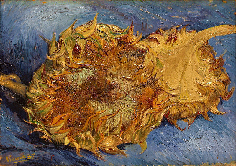
Look at this picture. What colors do you see? List the three colors you think are most easily visible in this painting.
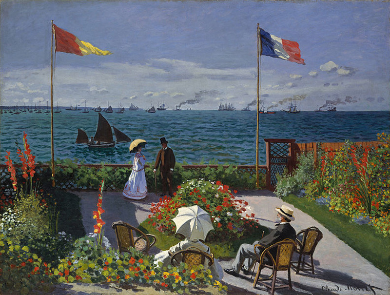
How about this one? What colors do you see here? List the three colors you think the artist used most in this painting.
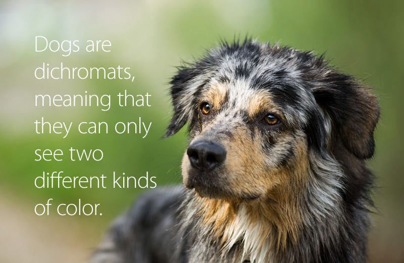
Three things to know about COLOR:
What is your favorite color? What do you think the most common favorite color in the world is? (Scroll down further to find the answer.)
To organize colors and show their relationship to each other, we use a color wheel. This shows the colors and how they are related to each other.
On a traditional color wheel, three colors are called primary colors. From these three colors, all of the colors on the color wheel can be made. The three primary colors on the traditional color wheel are red, yellow and blue. Can you find the primary colors on this color wheel? (Blue is the most popular color in the world.)
Like many disciplines, color has its own vocabulary. Watch the video below for an introduction to the language of color. Next, take the pre-assessment to see how much you already know about color's words.
The chart that shows the relationship of different colors to each other is called the (1) _______________________. Instead of the word "color," one could also use the three-letter word (2) ________.
The three colors from which all other colors are made are called (3)________________ colors, and they are (4)__________, ____________, and ____________. Colors that are created by mixing equal parts of the colors above are called (5) _____________________ colors, and they are (6) _______________, _______________, and ____________________. Colors that are created from equal parts of each of the two kinds of colors above are called intermediate or (7)________________________ colors. When describing these colors, place the (8) ________________ color first.
Colors that are next to each other on the color wheel are called (9)___________________. Colors that are opposite to each other on the color wheel are called 10)_______________. When these colors are placed next to each other, they make each other seem (11) ____________________. When mixed equally, they create muddy tones like black, gray, and brown.
If you add white to a color, that is called a (12) ______________. If you add black to a color, that is called (13)_________________.
If something only uses one color, it is called (14)______________________________.
If something uses more than one color, it is called (15) _________________________.
If something is completely lacking in color, it is called (16)_______________________.
The colors on the green/blue/violet side of the color wheel are called (17) ___________. The colors on the red/orange/yellow side of the color wheel are called (18) __________.
When completed, check your answers. If you got at least 14 of the 18 correct, move on to Lesson 3 below. If you didn't, read more about basic color theory before you move on.
In the pictures below, you will find examples of many of the colors on the color wheel. Answer the questions that go with each picture.
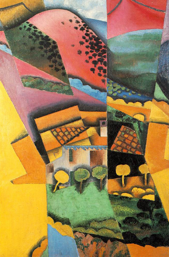
This painting, called Landscape at Ceret, was painted by the Spanish artist Juan Gris.
In the painting, identify six places where you see the three primary colors. Then, identify two places where you see two primary colors next to each other. Place a checkmark on two places you see a primary color adjacent to a secondary color. Circle a place you see a shade of blue. Circle a place you see a tint of green.
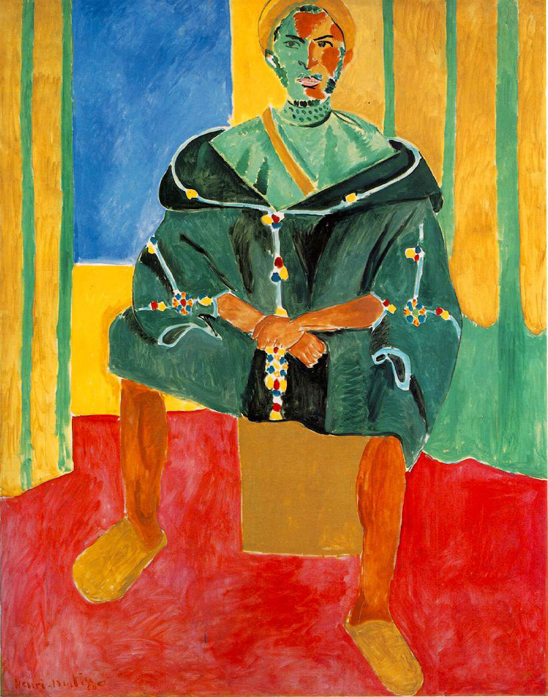
This painting, Le Rifain assis, was painted by the French artist Henri Matisse.
This painting has a very narrow color palette. List the colors you see in the painting and identify them as primary (p) or secondary (s) or neither (n).
Below, you will find this same painting in black and white. Using colored pencils, crayons, or fine tip markers, color in the painting. Instead of reproducing the colors the way you see them in the painting on the previous page, select a complementary color (remember that those are opposite each other on the color wheel). For example, where you see green, color a corresponding shade or tint of red, and where you see blue, color in orange. Use Adobe's color wheel to find the complementary color — just spin the wheel until you see the color you are looking for, and its complement will be on the other side.
What did you notice in doing this exercise about how the feeling of the painting changed? Is the painting happier? More sad? Darker? Lighter?
.jpg)
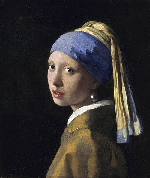
In this painting by Johannes Vermeer called Girl with a Pearl Earring, the color palette is very limited, yet in an entirely different way from the Matisse painting shown before.
Originally, the dark background had a green glaze over it, but this is no longer visible. Imagine what the color green would have looked like next to the colors you can see now. Where do you think it would have made more difference, in the skin or the clothing?
Art historians have found that Vermeer used 11 pigment colors in this painting:
This painting shows how complex color can become. Painters do not simply load their brushes with a color and add it to the canvas; they mix the colors on a palette first. Additionally, some of the colors Vermeer used are no longer visible. This can make it hard to detect the colors in the painting, but you may be able to see some of them. Knowing these things, what colors from the pigments listed above do you think you can find? It may help to to take a closer look at the painting.
Although the painting looks simple, upon close examination, it is a complex blend of colors. Create an "eye spy" activity for the painting, using this rubric. You may look at the National Book Fesitival for an idea (look at the poem at the bottom for an example of a rhyming, poetic form).
Conduct a small research study on people's favorite colors. With help from your teacher or parents, identify four people you can interview. You will ask the questions below, and one more that you create (add that to the last, blank line).
Good research etiquette is that you will not interrupt, not share your own opinion to agree or disagree with the responses, and thank the person sincerely for his/her time.
Analyze your data. Did any patterns emerge of favorite or least favorite colors? Were the favorite colors of the people you interviewed stable or had they changed?
Add up the total number of the estimated color names and divide by four to find the average number of colors your interviewees think they can name. How many of the favorite colors were primary colors?
How did your findings compare with what we know about the most popular color in the world? How many were secondary colors? What in your findings surprised you? What did you discover in the responses to the question you created? Let this rubric guide you.
Lesson 1:
Lesson 2: Color Vocabulary Pre-Assessment Key:
Lesson 3: The initial activities in this lesson are subjective, to a great extent. If you desire to assess, look for full and reasonable responses. The rubric for the Eye Spy activity is included in the section.
Lesson 4: The rubric for the independent research is included in the section.
Young Readers:
Older Readers:
This series of lessons was designed to meet the needs of gifted children for extension beyond the standard curriculum with the greatest ease of use for the educator. The lessons may be given to the students for individual self-guided work, or they may be taught in a classroom or a home-school setting. Assessment strategies and rubrics are included at the end of each section. The rubrics often include a column for "scholar points," which are invitations for students to extend their efforts beyond that which is required, incorporating creativity or higher level technical skills.